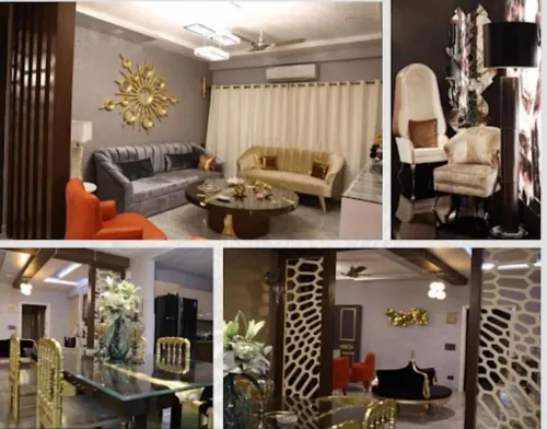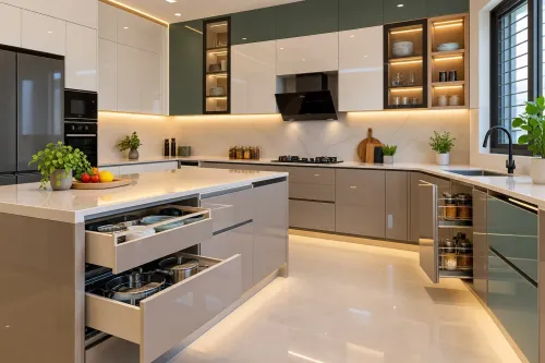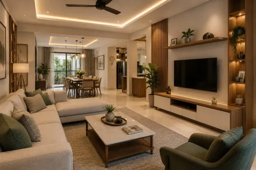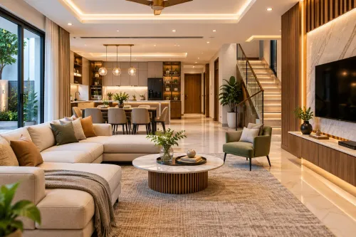
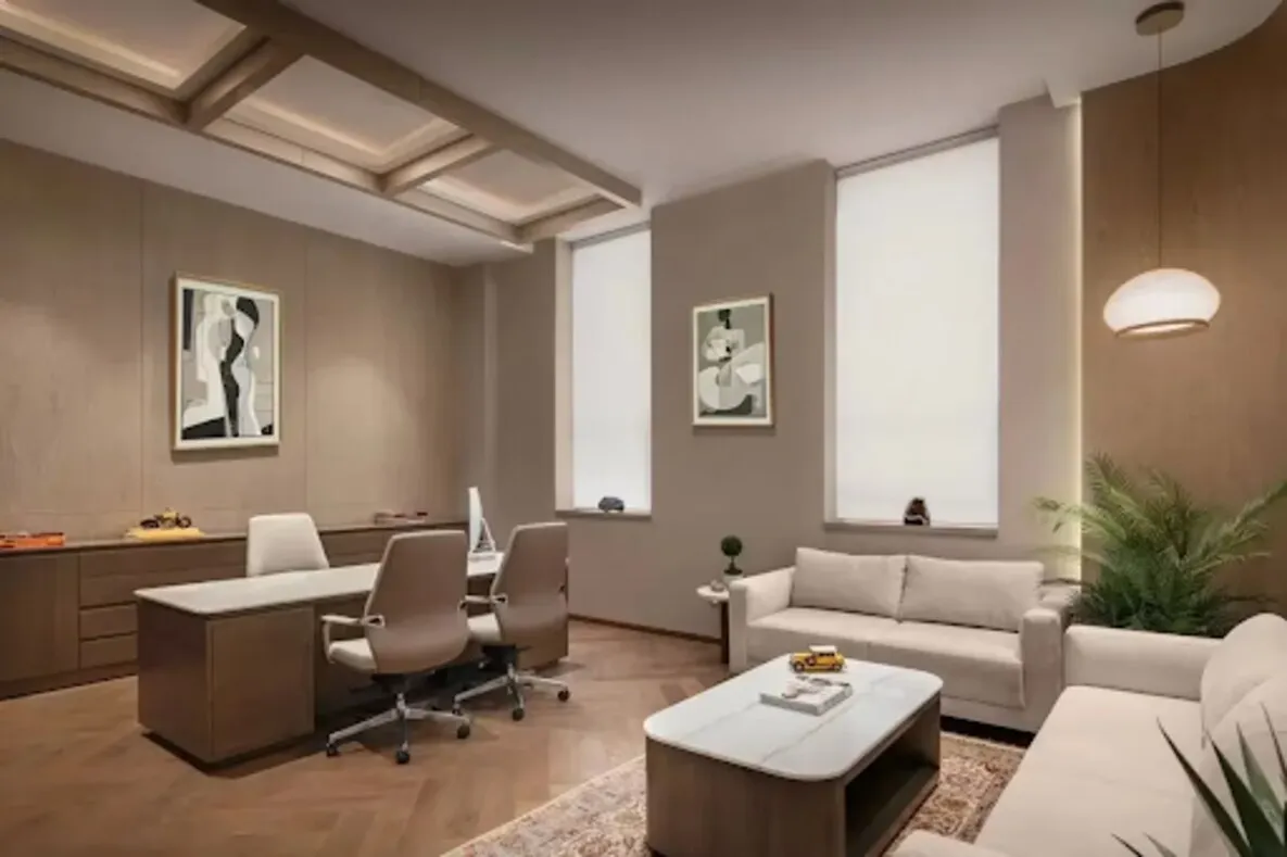
A commercial space can look impressive and still lose customers through confusing entrances, slow queues, noisy rooms, missing storage, or staff routes that cross public areas. A sound plan starts with operating facts, maps every user journey, separates competing movements, and translates brand identity into decisions that remain effective after furniture and finishes change.
Key takeaways
- Write an operational brief before selecting finishes or furniture.
- Map every customer step from arrival through repeat visits.
- Separate customer circulation from staff movement and service access.
- Test layouts against peak demand, safety, maintenance and daily work.
Start with an operational brief, not a style board
Before drawing walls or choosing finishes, collect the facts that determine how the business operates. A commercial interior brief should become an operational space program, not a style board. Record customer groups, staffing levels and occupancy, peak-use periods, activities, equipment, storage, security zones, and the adjacencies each task requires.
- Identify every user: visitors, buyers, diners, patients, clients, delivery personnel, repeat customers, and staff. Note what each group needs at arrival, waiting, service, payment, exit, and return.
- Map staff tasks and handoffs, including workstations, communication points, equipment, lockers, toilets, break areas, cleaning stores, and back-of-house capacity. Record the busiest hour, not only the daily average.
- List fixed constraints before planning furniture: structural columns, slab levels, electrical points, plumbing, HVAC grilles, sprinkler heads, appliance clearances, access panels, door swings, emergency exits, and fire-separation requirements.
- Set measurable planning controls for the intended occupancy: clear routes, travel distances, door openings, corridor widths, evacuation paths, emergency lighting, and sprinkler coverage. A 36-inch accessible route and 32-inch clear door opening are useful ADA benchmarks, but Delhi NCR projects must meet applicable Indian codes and local approvals.
- Mark storage, deliveries, waste removal, security levels, and service access separately from customer areas. Resolve stone, veneer, glass, metal, lighting, hardware, and built-in furniture junctions in coordinated drawings and samples before fabrication.
Use the brief as a testable baseline. After opening, compare it with queue conflicts, glare, noise, privacy, maintenance problems, and staff workarounds; those findings improve the next revision.
Map the customer journey from arrival to return visit
A layout earns its keep when a first-time visitor can move from entrance to service point without asking where to go. Customer journey mapping turns that test into a plan: mark each decision, pause, queue, transaction, and exit, then place spaces in the order customers actually use them.
- Arrival and reception: keep the entrance visible from the approach, provide a clear threshold, and give reception a direct sightline to the route ahead.
- Waiting and browsing: place seating or displays where they do not narrow the accessible route, block doors, or force people into queues.
- Service delivery: position consultation, dining, fitting, or treatment areas after customers receive direction, not across a service route.
- Purchasing and payment flows: provide queue depth, counter approach space, and a visible checkout without making exiting customers cross incoming traffic.
- Exit and return visit: make washrooms, lifts, exits, and the route back to reception legible from ordinary circulation.
Accessibility must shape these distances from the first drawing. Use a 36-inch clear route as an ADA benchmark. Allow a 32-inch accessible door opening. Reserve a 60-inch wheelchair turning circle, then verify Indian and local requirements for the project. A narrow display aisle or swinging door can turn a beautiful plan into a dead end.
Use sightlines, contrast, landmarks, and consistent signs to answer “Where am I?” and “What next?” Signage supports a legible layout; it cannot rescue a hidden entrance or obstructed route. Test the plan with different users, including someone using a wheelchair, someone with low vision, and someone returning for a second visit.
Separate public movement from staff work and service access
Keep customer circulation separate from staff workflow, deliveries, waste removal, and maintenance access. Draw a public route from entrance to reception, browsing, service points, payment, and exit; draw a second network for staff and supplies. Shared corridors create collisions, expose clutter, and make routine restocking feel like a disruption.
Staff workflow planning starts with the tasks that happen away from customers: receiving goods, storing stock, preparing service areas, cleaning, handling waste, and taking breaks. Place back-of-house zones beside the rooms they support, then calculate storage capacity and adjacencies from item sizes, access frequency, equipment clearances, seasonal stock, and who retrieves each item.
Build the plan around these controls:
- Put a receiving door near stock storage, not beside the main customer entrance. Provide a route wide enough for the largest trolley, carton, or appliance used on site.
- Position frequently used supplies between the storage room and their point of use. Staff should not cross a dining area, showroom, or waiting zone to retrieve them.
- Give waste a closed holding point with a direct route to collection. Do not wheel bins through customer queues during operating hours.
- Use controlled doors, staff-only corridors, lockers, toilets, and break areas to keep personal movement out of public space.
Service circulation must also preserve exit access, door swings, fire-separation requirements, emergency lighting, and sprinkler coverage. Coordinate partitions, counters, access panels, plumbing, electrical points, HVAC, and furniture before fabrication; a late service route often produces site cutting, blocked maintenance access, or unusable storage.
Turn brand identity into a repeatable spatial system
A logo at reception cannot rescue a confusing entrance, harsh lighting, or a counter that slows service. Brand identity in interiors becomes credible when customers encounter the same decisions in arrival zones, circulation areas, consultation points, and staff-operated touchpoints.
Build the system around repeatable choices:
- Layout: use proportions, sightlines, thresholds, and pause points that reflect the brand’s pace, whether calm and private or energetic and social.
- Material palette: limit stone, veneer, metal, glass, upholstery, and hardware to combinations that remain recognisable across locations.
- Lighting character: define colour temperature, contrast, glare control, and feature-lighting positions instead of choosing fittings one room at a time.
- Furniture: repeat silhouettes, edge details, heights, and upholstery types across waiting, dining, work, and display areas.
- Acoustic comfort: combine ceiling absorption, upholstery, curtains, wall treatments, or concealed panels so hard surfaces do not destroy speech privacy.
- Sensory details: coordinate temperature, fragrance, tactile finishes, background sound, and service rituals with the brand’s intended experience.
Apply signage after the plan has made entrances, reception, washrooms, lifts, checkout, and exits easy to find. Consistent type, contrast, mounting heights, and placement reinforce identity; signage cannot repair poor sightlines.
Resolve junctions before production. Coordinate drawings and physical samples for stone-to-metal, veneer-to-glass, lighting-to-ceiling, and furniture-to-wall interfaces, then build a full-size mock-up for critical details. Small misalignments become conspicuous in a restrained luxury interior, while a repeatable specification protects the experience during maintenance and future expansion.
Test the design against coordination, safety, maintenance, and real use
Approve the interior only after it survives four tests: coordination, fire safety and evacuation, maintenance planning, and observed use. Review the evidence before fabrication, then repeat the review after customers and staff occupy the space.
1. Check the design coordination drawings against the architectural, structural, electrical, plumbing, HVAC, and fire-protection plans. Confirm appliance clearances, electrical points, sprinkler heads, access panels, door swings, ceiling levels, and service routes.
For a bespoke kitchen, wardrobe, or office fit-out, ask Design Doves to resolve these interfaces before manufacture; otherwise site cutting creates filler panels, delays, and lost storage.
2. Run the intended occupancy through the fire safety and evacuation plan before fixing partitions, screens, displays, or furniture. Verify exit access, travel distances, door swings, corridor widths, fire separation, emergency lighting, and sprinkler coverage against the applicable Indian code and local approving authority’s requirements.
A beautiful display that narrows an escape route is a failed design.
3. Test maintenance with a cleaning and replacement schedule. Identify how staff will reach concealed services, replace lamps, repair floor transitions, clean high-touch finishes, and renew damaged upholstery or hardware. Reject details that require dismantling half the room for a routine repair.
4. Conduct a post-occupancy evaluation after opening, using staff interviews, customer comments, and timed observations. Record queue conflicts, glare, noise, privacy failures, storage shortages, and workarounds, then correct the layout or operating procedure rather than treating the drawings as final.
Related product
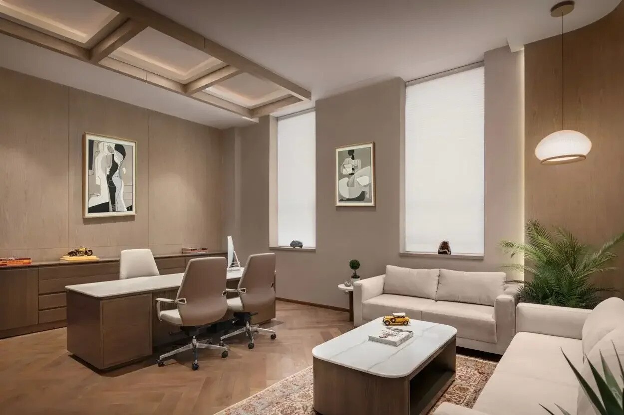 | Interior design Workspaces That Think, Create, and Inspire. We create dynamic and modern workspaces that foster productivity and innovation. View product → |